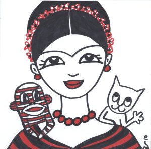
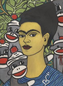
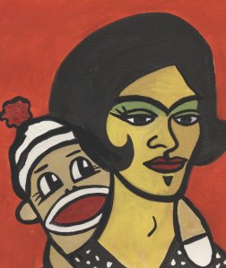
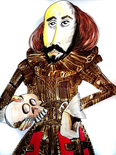
This is small simple diagram showing the possible idea of combining the character and arrow wayfinding ideas into one. As the diagram shows, this could be done by using the arrows as normal to direct you to your destination but then the different characters could be placed in their respecting department to show you have arrived at your chosen destination/location in the building. I think the combination of both would work really well as it would tie in with making the way-finding more informative but also more creative and visually appealing with a touch of humour to it.
Monday, 2 May 2011
Final idea for way-finding (arrows)
This is my final way-finding idea. I improved taking inspiration from the colour scheming of the London underground and applying this to the different department and areas of the new building. I did this by colour coordinating the arrows. When you first walk into the building a huge information board will greet you with a list of all the areas of the building with an individually coloured arrow to next to each place. The arrows on the board will match the arrows that drape themselves across the interior of the building. You follow the arrows which leads you to your destination. In some cases the arrows might stop and then re start a couple of yards down, on the other side of a corridor for example. I think this idea works really well as the different coloured arrows add vibrancy and colour to the interior of the building. They also make the viewer see the arrow all around the interior from every ceiling to every wall and corner, so it really lets the person take in the full personality of the building not just the everyday things you see, and it lets you view things that other times you would look past in a building. I also think this form of way-finding makes you feel more involved, like you're in a treasure hunt game, where you have to physically follow the arrow which leads your path to your chosen destination. This as a result i think makes finding your destination easy and efficient but also enjoyable and fun and different to the usual forms of signs and maps.
Final idea for Strand Characters (art, theatre)
This is the final idea for Frida Kahlo's character which would be placed in the art block and represent the area of the art block. I think the picture works well because it captures Kahlo in the middle of doing something stereotypically artist.; painting on a canvas. Kahlos features have been extensively exaggerated and as result i think it really adds to the whole humour and cartoon feel of the image. The funny fact was of Mona Lisa's lips which is placed on the painting canvas. I made a grammatical mistake where i have missed out the first part of Mona Lisa's name - 'Mona'. Initially i was disappointed with this mistake but on reflection i think it gives the image a slightly quirky feel, as if Kahlo herself accidentally wrote out the sentence wrong then corrected herself, this i think actually adds to the humour of the picture. Finally, even though i did Kahlos features in an exaggerated and cartoon style, i feel that it is definitely recognisable as to who is she is meant to be.
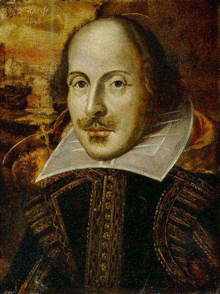
This is the final drawing of the idea of Shakespeare as a cartoon character which would be located in the theatre department in the new building. It would represent theatre strand in the new building. I showed Shakespeare in the process of reading something out loud, something you'd expect to see a theatre student do when performing for example. It also gives Shakespeare a more theatrical feel on the whole and as result makes it more recognisable as to who he represents in terms of the different school departments. I also think i captured him accurately in terms of giving him a cartoon look but also keeping his identity clear for viewers to easily recognise him. His funny fact is written on the back of the scroll he is reading, so it gives the impression that he could be in the process of reading this fact out, what makes this more humorous is that fact is of the funny law in Illinois where people cant remove their shoes if their feet smell. I think the combination of the funny fact and Shakespeare looking like he's reading out this fact makes the design even more humorous indeed and as result gives out a positive effect on passers by who'd read it.
Character Sketches - Art
These are the two sketches i did for Frida Kahlo. The first is a more accurate depiction of the mexican artist while the lower one is a more simplistic cartoon version. I feel that the cartoon version is a little too simplistic and so i will probably add some detail in terms of accentuating her main features like her brow, lips and hair.
Sunday, 1 May 2011
Interesting facts for Art
1) Most artists are left handed.
2) Picasso was baptized Pablo Diego José Francisco de Paula Juan Nepomuceno María de los Remedios Cipriano de la Santísima Trinidad Martyr Patricio Clito Ruíz y Picasso. Thats 23 words!
3) It took Leonardo Da Vinci about ten years to paint Mona Lisa’s lips.
2) Picasso was baptized Pablo Diego José Francisco de Paula Juan Nepomuceno María de los Remedios Cipriano de la Santísima Trinidad Martyr Patricio Clito Ruíz y Picasso. Thats 23 words!
3) It took Leonardo Da Vinci about ten years to paint Mona Lisa’s lips.
Character Development - Art
Frida Kahlo
Frida Kahlo de Rivera was a Mexican painter, born in Coyoacán, and perhaps best known for her self-portraits. Kahlo died on 13th July 1954.
Frieda Kahlo is most definitely an icon in the art world and has a striking appearance which i feel will make her easily recognisable to viewers. Her famous uni-brow is also a recognisable and eye catching feature which i think will be easy and effective to include in my illustrations of her.
Character sketches - Theatre
These here are two short sketches i did of William Shakespeare. One is a relatively detailed accurate sketch of Shakespeare and the other is a more toned down slightly cartoon like version. I want to opt more for a cartoon feel as i think it goes along well with my ambition of the design being humorous and light hearted. My aim was give Shakespeare a more caricature feel, i went along with this by exaggerating features such as his curled moustache. The More accurate scketch also serves as a template to which i have expanded on in terms of manipulating features to fit a more cartoon feel.
Interesting Facts to use for Theatre
Here are a list of interesting facts that i feel i could use for what shakespeare says on Theatre.
1) The first actor to appear on stage was in 534 BC!
2) The first theatre in England was aptly named "The Theatre."
3) The Globe Theatre was not only used for theatrical performances. It was also used forbear baiting, gambling and other immoral purposes.
4) In Winnetka, Illinois, it was once against the law to remove your shoes in a theater if your feet smelt bad.
5) In the 17th century, many boy actors died prematurely due the lead poisoning in the make up
6) Shakespeare and his company built TWO globe theatres!
Character Development - Theatre
My character has to look like it relates to Theatre, so i came to the conclusion that it should be a famous figure in theatre as apposed to just a cliche as i feel it would add to the humour of the work and make it more recognisable to viewers.
Shakespeare
William Shakespeare was an English poet and playwright, widely regarded as the greatest writer in the English language and the world's pre-eminent dramatist. He is often called England's national poet and the "Bard of Avon". His surviving works, including some collaborations, consist of about 38 plays, 154 sonnets, two long narrative poems, and several other poems. His plays have been translated into every major living language and are performed more often than those of any other playwright. Shakespeare Died on the 23rd April 1616
I've chosen to use Shakespeare as my character for Theatre as he is well known around the world for his famous theatre plays which consequently form the foundations of live theatrical performance. His plays are re done in drama classes around the world and i think using an inspiring figure like shakespeare sends out a positive message to its students and adds the illustrious image of theatre strand on a whole.
Character Idea
When brainstorming i came to the idea that Creating characters to show where you are with little fun facts on the department would be a great idea! (as briefly seen on my powerpoint presentation, i took inspiration from comic book characters and the use of speech bubbles to tell messages)
Other than my Arrow arrow idea, my alternative idea is to have a series of characters which each represent a strand or section of brit eg. theatre, art, ict, science. My idea involves having caricatures of well known figures appearing around certain parts of the new building and saying an interesting fact about the subject or strand they represent. For example i would have a famous figure from the theatrical world say an interesting fact about theatre and a famous figure from the art world say an interesting fact about visual arts and design. The characters would be located where ever their representing subject or strand block is in the new building.
Other than my Arrow arrow idea, my alternative idea is to have a series of characters which each represent a strand or section of brit eg. theatre, art, ict, science. My idea involves having caricatures of well known figures appearing around certain parts of the new building and saying an interesting fact about the subject or strand they represent. For example i would have a famous figure from the theatrical world say an interesting fact about theatre and a famous figure from the art world say an interesting fact about visual arts and design. The characters would be located where ever their representing subject or strand block is in the new building.
I feel this idea works well because it uses clever illustrative designs which would make the interior of the building more aesthetically pleasing and it allows you to identify which part or section of the building you are at. I also feel its a subtle touch that doesn't overwhelm you because it wont take up entire walls, just a small section in different parts of the building which as a result would allow other designs of the interior to also feature along side this idea which i feel makes this concept very flexible an easy for the designer to alter and improve if need be. Finally, i think this idea has a bit of humour to it which sends out a funny relaxed message to its students thus creating a calmer more positive working environment for all people attending the school.
I've planned to do 2 examples of characters in my idea. They will be for Theatre and Art.
I've planned to do 2 examples of characters in my idea. They will be for Theatre and Art.
Saturday, 30 April 2011
Review of Arrow Way-finding idea
I looked at improving the practical side of my arrow way-finding idea as i felt the aesthetic look of it was fine and up to scratch and how i wanted it to be. By improving the practical side of it, i looked at just having a large board with all the areas of the building colour coordinated to match the the arrow, thus making it easier to navigate your way round using the arrow you needed depending on its colour, it also made it more recognisable.
Tuesday, 26 April 2011
Review of work so far & Arrow Idea
I feel my arrow idea has been a good start but i think as a newcomer to the building it would be difficult to navigate with just the use of arrows and an overly arty destination board. So as result i feel my idea, as it stands at the moment, would be a little too confusing and not clear enough with the combination of straight forward info and just arrows; i need to focus more on the informative side of the deisgn now and less on the arty design for the wayfinding part of the building. Secondly, I think it will still be more than easy for the architect to incorperate the design into the new building as i feel the use of paint doesnt have a lasting effect on the structural design of the building and therefore it means if need be, the design can be modified with reletive ease and without the need to tamper with the actual building itself just the decor side of it all. My design could also be used in the rest of the school due to its simplicity and flexability.
I definitely want expand on the design part of my general idea and not just have arrows. so maybe a nice design feature which easily distinguishs where abouts you are in relation to the rest of the building we be a good improvement on my current idea.
So when reviewing my current ideas at the moment these are the three main tragets i have set for myself:
1) Explore different ways of making the arrow wayfinding design clearer and easier to navigate with .
2)Explore possible ideas for the Design part of the building e.g, wall pattern designs, colour schemes
3) work on moulding two ideas together
Monday, 18 April 2011
Different Ways Of Approaching Branding
- Tv advertising
- Surveys
- Questionnaires
- Link the product you're selling to a target audience
- Magazines
- Public transport
- Statistics
- Is it male or female orientated?
- Surveys
- Questionnaires
- Link the product you're selling to a target audience
- Magazines
- Public transport
- Statistics
- Is it male or female orientated?
My BRIT Logo Design
This is my interpretation for the BRIT school logo. It reads BRIT with the 'i' also being a dancing figure to show that the school specialises in performing arts. However it could be slightly difficult to distinguish the the last letter T as it is slightly obstructed by the the leg of the figure. overall though i think the logo works well as it combines visual imagery with lettering and as a result makes it clear to the viewer what the logo is all about. I also think the logo has a nice free flowing movement to it which represents the spirit of the school and the attitude of its students and teachers. Finally, i feel the use of the colour green as apposed to the current orange is nicer as it has a more subtle feel and is less outlandish and vulgar in my opinion. the green suggests freshness which relates to the fresh talent this school unveils every year!!!
Aedas
Aedas is world wide architectual firm which work on mixed-use developments, transportation, education, sport and healthcare building design. They offer services in architecture, interior design, master planning, landscape, urban design and building consultancy within Asia, the Middle East, Europe and the Americas. They have designed and are constructing the 2022 Qatar world cup finals soccer stadium which holds 86,000 spectators and has inner stadium air conditioning to tackle the hot climate there, a first in the football stadium world. Aedas work on all sorts of architectual projects across the world and are leaders in creating new and innovative designs.
The Qatar Soccer stadium which 86,000 spectators
Iris Crystal Tower, Dubai
Monday, 11 April 2011
A3 board for BRIT
In the lesson we were told make a small questionnaire again but this time go around the school asking students and teachers alike what they thought about the BRIT school on a whole and what they'd like to see encompassed in the design of the new building. We were also told to collect images of the BRIT schools buildings and create a mood board like A3 page on what BRIT was like.
Quick concept design sketches on new Selhurst building
Here are just a couple of quick sketches i did on what i thought the new building should look like. My teacher told me not to worry about making it realistic as such now, but to just elaborate on initial ideas and come up with a couple of creative concept designs for the building. Heres what i came up with quickly.
I took inspiration from Igloos, the Ghirkin tower and Arsenals Emirates stadium when creating this concept design. The top two levels of the building would be made of glass panels, allowing views over the rest of the school site and allowing maximum daylight to pass through lighting up rooms considerably. on the bottom level though the building has an opaque out layer because i took into account the large proposed theatre stage and that it would make more sense to have that place be dark.
Heres an idea for way-finding inside the building. It would be to have giant arrows on the floor and ceiling with the place name you need to find scrolling down digitally inside it. Also each arrow would be colour coordinated with the the place of interest and so would be easily more recognizable with the viewer as they navigate their way round the building.
Saturday, 9 April 2011
Thursday, 7 April 2011
My Questionnaire
We were told to come up with questions to ask students on what they'd like to see in the design of the new interior of the building. We had to make sure that our small questionnaire was 'small' and that it had a few simple straight to the point questions in it as apposed to a large number of detailed complex questions which would probably loose our target participants interest.
Your Opinions On What The New Building Interior Should Look Like
1) What kind of style do you want the interior design to incorporate? Eg abstract pattern, urban
2) Is there a preferred medium you'd like to have used? Eg. Video, Paint, Interactive
3) Do you want to have a consistent design throughout the building, or different designs for the different strand blocks?
4) Finally, would you prefer the design to be up tempo and high energy or more subtle and subdued on a whole?
Thank you very much for your time,
Visual Arts & Design Strand
Plans for new school building project
On tuesdays lesson, one of the key architects for the new school building project briefed us on what was in store for the proposed plan. He told us that our part in the project was to come up with visual designs for the signing of the foyer and corridor parts of the building, making sure they were aesthetically pleasing and original but also easy to understand and navigate around the building using them.
Here is a copy of the blue prints of the 1st floor, the grey shaded area is what year 12 art strand will be working on:
Here is a copy of the blue prints of the 1st floor, the grey shaded area is what year 12 art strand will be working on:
Friday, 1 April 2011
Empire State Building, New York
Architect: William F. Lamb of Shreve, Lamb and Harmon Architect Firm
Structural Engineers: H.G. Balcom of H.G. Balcom and Associates
The Empire State Building was completed in 1931 and is greatly seen as one of the seven wonders of the modern world. while it was being built it was in stiff competition to be the worlds tallest building against other projects like the Chrysler building also of New York. For more than 40 the Empire State stood as the tallest building in the world until it was surpassed by the twin towers (temporerily) however in recent years projects in dubai have topped it and the empire state is now ranked the 15th tallest building in the world. The building was officially opened on May 1, 1931 in elaborate fashion, when the United States President at the time Herbert Hoover turned on the building's lights with the push of a button all way from Washington, D.C. Coincidentally, the first use of tower lights atop the Empire State Building, the following year, was for the purpose of signaling the victory of Franklin D. Roosevelt over Hoover in the presidential election of November 1932. Today the Empire State is a large tourist attraction New York, with its incredible 360 degree views of surrounding Manhatten.
Subscribe to:
Posts (Atom)


