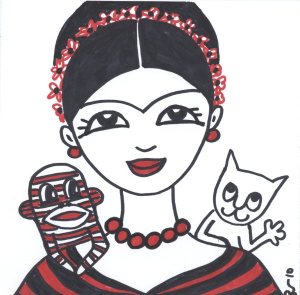
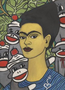
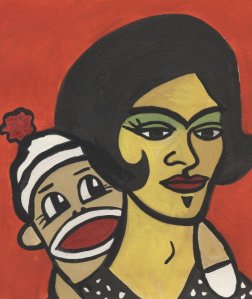
This is small simple diagram showing the possible idea of combining the character and arrow wayfinding ideas into one. As the diagram shows, this could be done by using the arrows as normal to direct you to your destination but then the different characters could be placed in their respecting department to show you have arrived at your chosen destination/location in the building. I think the combination of both would work really well as it would tie in with making the way-finding more informative but also more creative and visually appealing with a touch of humour to it.
Kumi's design project - 'Brand'
Monday 2 May 2011
Final idea for way-finding (arrows)
This is my final way-finding idea. I improved taking inspiration from the colour scheming of the London underground and applying this to the different department and areas of the new building. I did this by colour coordinating the arrows. When you first walk into the building a huge information board will greet you with a list of all the areas of the building with an individually coloured arrow to next to each place. The arrows on the board will match the arrows that drape themselves across the interior of the building. You follow the arrows which leads you to your destination. In some cases the arrows might stop and then re start a couple of yards down, on the other side of a corridor for example. I think this idea works really well as the different coloured arrows add vibrancy and colour to the interior of the building. They also make the viewer see the arrow all around the interior from every ceiling to every wall and corner, so it really lets the person take in the full personality of the building not just the everyday things you see, and it lets you view things that other times you would look past in a building. I also think this form of way-finding makes you feel more involved, like you're in a treasure hunt game, where you have to physically follow the arrow which leads your path to your chosen destination. This as a result i think makes finding your destination easy and efficient but also enjoyable and fun and different to the usual forms of signs and maps.
Final idea for Strand Characters (art, theatre)
This is the final idea for Frida Kahlo's character which would be placed in the art block and represent the area of the art block. I think the picture works well because it captures Kahlo in the middle of doing something stereotypically artist.; painting on a canvas. Kahlos features have been extensively exaggerated and as result i think it really adds to the whole humour and cartoon feel of the image. The funny fact was of Mona Lisa's lips which is placed on the painting canvas. I made a grammatical mistake where i have missed out the first part of Mona Lisa's name - 'Mona'. Initially i was disappointed with this mistake but on reflection i think it gives the image a slightly quirky feel, as if Kahlo herself accidentally wrote out the sentence wrong then corrected herself, this i think actually adds to the humour of the picture. Finally, even though i did Kahlos features in an exaggerated and cartoon style, i feel that it is definitely recognisable as to who is she is meant to be.
This is the final drawing of the idea of Shakespeare as a cartoon character which would be located in the theatre department in the new building. It would represent theatre strand in the new building. I showed Shakespeare in the process of reading something out loud, something you'd expect to see a theatre student do when performing for example. It also gives Shakespeare a more theatrical feel on the whole and as result makes it more recognisable as to who he represents in terms of the different school departments. I also think i captured him accurately in terms of giving him a cartoon look but also keeping his identity clear for viewers to easily recognise him. His funny fact is written on the back of the scroll he is reading, so it gives the impression that he could be in the process of reading this fact out, what makes this more humorous is that fact is of the funny law in Illinois where people cant remove their shoes if their feet smell. I think the combination of the funny fact and Shakespeare looking like he's reading out this fact makes the design even more humorous indeed and as result gives out a positive effect on passers by who'd read it.
Character Sketches - Art
These are the two sketches i did for Frida Kahlo. The first is a more accurate depiction of the mexican artist while the lower one is a more simplistic cartoon version. I feel that the cartoon version is a little too simplistic and so i will probably add some detail in terms of accentuating her main features like her brow, lips and hair.
Sunday 1 May 2011
Interesting facts for Art
1) Most artists are left handed.
2) Picasso was baptized Pablo Diego José Francisco de Paula Juan Nepomuceno María de los Remedios Cipriano de la Santísima Trinidad Martyr Patricio Clito Ruíz y Picasso. Thats 23 words!
3) It took Leonardo Da Vinci about ten years to paint Mona Lisa’s lips.
2) Picasso was baptized Pablo Diego José Francisco de Paula Juan Nepomuceno María de los Remedios Cipriano de la Santísima Trinidad Martyr Patricio Clito Ruíz y Picasso. Thats 23 words!
3) It took Leonardo Da Vinci about ten years to paint Mona Lisa’s lips.
Character Development - Art
Frida Kahlo
Frida Kahlo de Rivera was a Mexican painter, born in Coyoacán, and perhaps best known for her self-portraits. Kahlo died on 13th July 1954.
Frieda Kahlo is most definitely an icon in the art world and has a striking appearance which i feel will make her easily recognisable to viewers. Her famous uni-brow is also a recognisable and eye catching feature which i think will be easy and effective to include in my illustrations of her.
Subscribe to:
Posts (Atom)


